A cream render house works best when the shade is taken from the setting — a soft cream or ivory for most period homes, a buff or stone tone where the local building stone is warm, and a limewash cream on traditional lime render. Warm shades flatter clay tiles, timber, brick and stone, and hide everyday dirt better than white. The risks are creams that lean too yellow and turn dated or orange in low sun, and modern finishes on old walls that need to breathe. On an older solid-walled house, choose the right system first and the colour second.
- Creams, buffs and stone tones are a family — pick the depth that matches your setting.
- Take the colour from local stone, then go a shade lighter for the whole wall.
- On lime render, a limewash cream keeps the wall breathable and can be renewed.
- Cream hides dirt better than white, but very yellow creams date quickly.
- Bright white uPVC makes a deep cream look yellower — test them together.
- In a conservation area or on a listed building, a colour change may need permission or consent.
Why homeowners choose a cream render house
People tend to arrive at cream from one of two directions. Some own an older house — a farmhouse, a cottage, a Georgian or Victorian town house — and want a colour that looks as though it belongs to it. Others have tried a brilliant white on paper, or lived with one, and want something that feels warmer and needs cleaning less often.
Cream answers both, and it has a third quality that is easy to overlook: it is kind to imperfect walls. An old house rarely has perfectly flat, plumb elevations, and a stark white or a cool grey shows every undulation in raking light. A soft warm tone lets the wall read as a whole, which is often exactly what an older building needs. The catch is that cream covers a wide range, and the wrong end of it can make a house look tired rather than timeless.
Creams, buffs and stone tones
“Cream” covers a wider range than most people expect. Soft creams and ivories are whites with a little yellow or red in them: bright from the street, gentle up close. Buffs are deeper and sandier, with more yellow-brown. Stone tones sit between buff and grey, imitating the dressed stone that many rendered houses were meant to resemble.
For most houses the right answer is near the light end. A cream that looks gently warm on a small card can look distinctly yellow across a full, sunlit elevation. If you want the warmth without committing to an obvious cream, a warm off-white such as K-Rend Champagne sits just above the cream family.
Be wary of creams with a pink or peach cast unless that’s the local tradition; they can read as dated magnolia rather than period. For how cream compares with the other colour families, see our guide to render colours.
Why warm shades suit period and rural homes
Historically, render on British houses was very often not brilliant white. Lime render was commonly finished with limewash tinted with earth pigments, and much Georgian and Regency stucco was coloured to look like ashlar stone. A warm cream or stone shade puts many old houses back in their own visual language.
Warm shades also suit the materials period and rural houses tend to have: red and brown clay tiles, weathered natural slate, timber sash windows, brick chimneys and stone sills. Against those, a pure white can look stark and a cool grey can look like a modern intervention.
On a farmhouse or village house surrounded by fields and trees, cream also blends into the landscape rather than standing out from it.
Matching local stone
The surest way to choose a cream is to look at what the area is built from. Take your cue from stone quoins, window surrounds, boundary walls, the church or the oldest houses nearby, then choose a render shade a step lighter, because warmth looks more intense spread across a whole wall than in a few blocks of stone.
In honey-coloured limestone country such as the Cotswolds, a pale buff with a yellow lean sits naturally. In areas built from greyer or browner sandstones, a cooler stone cream with a touch of grey usually works better than anything yellow. On streets of pale limestone or stucco, a soft ivory is usually right.
Bring a sample outside and hold it against the stone itself, in daylight, rather than matching from photographs.
How cream reads in British light and on each elevation
Cream is the warm-light colour of the render palette, and that is both its strength and its risk. In soft, overcast light it stays warm where a white turns faintly blue-grey, which is a large part of its appeal on British streets. In strong, low evening sun the same wall can glow far yellower or more orange than it did at noon.
North-facing walls show a cream at its coolest and most subdued, so a shade that seems slightly too warm on the card can look just right there. South- and west-facing walls show it at its warmest and brightest; a buff that looks rich on the north side can look brassy here. East-facing walls look fresh in morning light and flatter later on.
Because you’ll use one shade on every side, judge it where it looks most extreme. On a house whose main elevation faces south or west, that usually means leaning lighter and less yellow than your first instinct.
Which houses suit a cream render
Cottages and farmhouses. Solid walls, small windows and clay or slate roofs are cream’s home ground. A limewashed cream or a soft buff on lime is usually the most authentic choice.
Georgian, Regency and Victorian town houses. Where the house was designed to be rendered or stuccoed, an ivory or pale stone shade suits it, especially with painted mouldings, cornices and window surrounds picked out in a slightly lighter or darker tone of the same family.
Interwar and post-war houses. A soft cream can work well, particularly with a red-tiled roof or a retained brick ground floor. Very yellow shades can make a plain house look dated rather than traditional.
New builds. Cream suits a new build designed in a traditional idiom — cottage-style proportions, timber or heritage-coloured windows, a pitched roof. On a crisp contemporary form with large glazing and anthracite frames, a pale stone or an off-white usually looks more intentional than a true cream.
Extensions. When rendering an extension to sit beside an older cream house, matching exactly is hard because the original will have weathered. Many owners either re-coat the whole house or deliberately choose a related but distinct shade for the extension.
How the render system and texture change a cream
The same cream looks and lasts differently depending on what it is made of. Modern thin-coat silicone and acrylic finishes are through-coloured, so the shade goes all the way through the top coat. Silicone is strongly water-repellent and tends to stay cleaner; acrylic is flexible but holds dirt more readily. Monocouche is a through-coloured scraped finish with a slightly open surface; its white lime bloom tends to be less noticeable on pale creams than on darker shades.
Painted sand and cement lets you change or refresh the cream at each redecoration, at the cost of the paint dulling and needing renewal. Our guide to through colour render compares the two approaches.
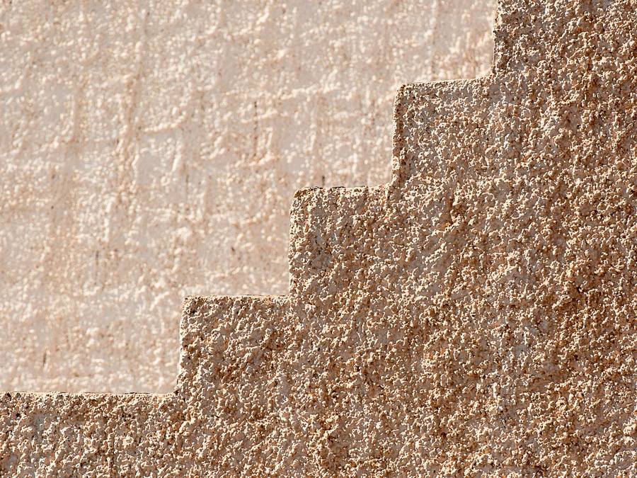
Texture shifts the colour as well. A fine, smooth finish shows the cream closest to the sample. A coarser grain or a dash catches shadow in every hollow and reads slightly deeper and more stone-like, which can be useful when you want a cream to look less bright. Ask for samples in the finish you’ll actually have.
On older solid walls, the system comes before the shade
Many houses that suit cream best are also the ones most sensitive to the wrong render. Solid stone, cob and older brick walls rely on moisture being able to evaporate out through the face. A dense cement render or a sealing coating can trap that moisture, and the damp ends up inside the house or behind the render, which then fails.
So on an older solid-walled house, the first question isn’t “which cream?” but “which system will let this wall breathe?”. That often points to lime, and sometimes to a vapour-open modern system specified by someone who has surveyed the wall. Our guide to is render breathable explains how different systems compare.
The good news is that the breathable route also gives some of the most beautiful creams available. The colour follows the system; it doesn’t have to be compromised by it.
Limewash creams on lime render
On older solid-walled houses finished in lime render, colour traditionally comes from limewash rather than a through-coloured finish. Limewash creams are tinted with natural pigments such as yellow ochre and raw sienna, giving a soft, chalky, slightly variable finish that modern render can’t imitate. It keeps the wall breathable and is renewed periodically, so the shade can be adjusted over time.
Limewash dries noticeably lighter than it looks when wet, so judge test patches only once they are fully dry. Several thin coats build up the colour; one thick coat is more likely to flake.
Don’t seal lime render with an ordinary acrylic masonry paint to get a cream; it can trap moisture in the wall. Our guide to lime render vs limewash explains how the two work together.
Pairing cream with timber and heritage colours
Timber windows and doors. Cream is at its best with painted timber. Heritage greens, off-black, deep blue, oxblood and soft stone greys all look rich against it. Untreated oak weathers to silver-grey and sits well with stone tones.
White uPVC. Bright white frames make a deep cream look yellower by contrast. Choose a soft cream or ivory, or consider frames in cream or a heritage colour when they’re next replaced.
Anthracite frames. They can work against a pale stone cream, but against a yellow cream they look severe; test both together.
Rainwater goods and roofs. Black cast iron or black uPVC gutters frame a cream wall neatly. Clay tile roofs suit warmer creams; grey slate suits stone creams with a hint of grey.
Cream with brick, stone dressings and a second colour
Plenty of cream houses aren’t rendered all over. Where a brick plinth, ground floor or chimney stays exposed, the cream needs to sit with the brick rather than fight it; a warm cream suits orange-red brick, while a cooler stone cream suits darker or browner brick. Our guide to render colours for red brick covers that junction in detail.
A second render colour can work on a cream house if it is used with restraint: a slightly deeper stone or buff for a plinth band, a bay or an extension, or a soft grey on a contemporary addition. Keep the change of colour on a corner, a bead or a change of plane, and keep both colours warm or both neutral.
How cream shows dirt compared with white
A cream hides splashback, road dust and the first green film of algae noticeably better than a bright white, simply because there is less contrast between the dirt and the wall, so it looks clean for longer between washes. Buff and stone tones are more forgiving still, which makes them a sensible choice on busy roads and exposed rural sites. If you’re torn between the two, our guide to the white render house sets out what white demands.
The trade-offs sit at the extremes. Very yellow creams can look tired under a grey sky. Deep buffs can look muddy in flat light. And on lime with limewash, expect gentle, uneven weathering — part of the character, not a defect.
Choosing a cream for an older house? SmartMatch™ pairs you with one vetted local render specialist for a free survey, written quote and samples on your wall.
Get a free quote →Three cream render scenarios
A stone farmhouse under a slate roof. The walls are solid rubble stone with patches of failing cement render. The priority is removing the cement and re-rendering in lime, finished in a limewash tinted to a soft stone cream with a touch of grey to sit with the slate. The colour is chosen last, by test patch, once the lime is on.
A rendered town house with stone sills and surrounds. The render is sound but tired. A pale ivory a step lighter than the stone dressings lets the surrounds frame the windows; the front door in a deep heritage colour does the rest.
A plain semi with a red-tiled roof and white uPVC windows. A deep cream would turn yellow beside the frames, so a soft cream at the pale end of the family suits better, with the brick plinth left exposed and the cream chosen to sit with it rather than match it.
Testing cream samples on your own walls
Cream often looks different on the house from the way it looked on a card, so sampling is worth the effort.
- Shortlist three. A paler, less yellow option, your favourite, and a slightly deeper or greyer stone tone.
- Use real samples. Boards or test panels in the actual system and texture, or properly dried limewash test patches on lime.
- Check two elevations. The sunniest wall, where the cream will look warmest, and the dullest.
- Check in evening sun. This is when a cream that is too yellow gives itself away.
- Check against the fixed elements. Window frames, roof, any stone dressings or brick, and the houses either side.
Then put the exact shade and system in writing on the quote. “The cream” can mean a dozen different colours.
Cream render, planning and listed buildings
In England, re-rendering in a similar appearance is usually permitted development, but changing the type or colour of render can alter the external appearance and may need permission. In a conservation area, National Park, National Landscape or the Broads, rendering needs planning permission. Article 4 directions can remove permitted development rights, and flats and maisonettes don’t have householder permitted development rights. Our guide to planning permission for rendering explains the process.
If the house is listed, works that affect its character — including a change of render or colour, or removing historic lime render — need listed building consent, and carrying out such works without consent is a criminal offence. Talk to the council’s conservation officer early; see our guide to rendering a listed building. Rules differ in Wales, Scotland and Northern Ireland, so always confirm with your local planning authority.
What a cream render house costs
Choosing cream rarely changes the price; the system, the wall area, the condition of the wall and access do.
As indicative supplied-and-applied guides, silicone typically runs around indicative £65–£95 per m², acrylic indicative £60–£90, monocouche indicative £55–£90, and sand and cement indicative £35–£60 before painting. Lime, the usual choice on older solid walls, is more like indicative £70–£125 per m². Where old render or pebbledash has to come off first, stripping and re-rendering is around indicative £100–£170 per m².
By number of walls, one elevation typically comes to around indicative £3,500–£5,000, two walls £5,000–£8,000, three £8,000–£12,000, and four or more £12,000–£17,000+. Ask for scaffolding and any repairs to the wall to be itemised. Our guide to house rendering cost explains what drives the figures.
How a cream render house ages and is looked after
A well-chosen cream ages gracefully. Through-coloured modern finishes mellow slightly as the surface weathers, and the warmth of the shade disguises the light film of dirt that builds up on any wall. Limewash weathers more visibly, eroding gently from exposed areas first; that softening is part of its appeal and the reason it is renewed rather than cleaned.
Look round the house each spring and autumn for the things that cause marks: blocked or leaking gutters, sills that drip down the face, soil or planting heaped against the base of the wall. When a modern finish does need cleaning, use a render-safe cleaner applied at low pressure and rinsed gently; avoid pressure washing, which can damage the surface. On lime, avoid harsh chemical cleaners and talk to someone experienced in lime before doing anything more than a gentle wash.
What to ask your renderer about a cream scheme
- Which system do you recommend for this wall, and why? Is it suitable for a solid wall that needs to breathe?
- Can I see samples in the real system and texture, or test patches of limewash, on the house?
- Have you matched a render to local stone before? Can I see photos of the finished job?
- How will you handle the junctions with stone dressings, brick or a second colour?
- Are sills, drips and the base of the wall being detailed to keep water off the face?
- Will each elevation be finished continuously to avoid patchy colour?
- Does the work need planning permission or listed building consent, and who is checking?
When cream isn’t the right choice, and next steps
Cream suits most period and rural houses, but not all. On a crisp modern build with anthracite frames, a cream can look like a compromise; our guide to the grey render house may suit better. On a street of uniform white or grey render, a strong cream can look out of step. Our guide to render colours covers the full palette.
On an older house, the system matters more than the shade, and cracked, hollow or damp-trapping render has to be dealt with before colour is even discussed. Our guide to exterior rendering covers the full picture.
SmartMatch™ weighs render-type experience, verified reviews, online reputation, insurance and accreditation to introduce you to one vetted local specialist for a free, no-obligation survey and written quote. Most of our specialists take on projects from around £3,500, so they’re best suited to larger repairs and re-renders; for a single small job, a local builder or plasterer may be quicker.
Frequently asked questions
What colour cream render looks best on a period house?
Is cream render better than white?
What goes with cream render?
Can I get a cream colour on lime render?
Does cream render look dated?
Does cream render show dirt?
Why does my cream look yellow on the house?
Does cream render suit a modern house?
Can I match new cream render to an older cream wall?
Do I need permission to change my render to cream?
See your cream on your own walls
Tell us about your property and SmartMatch™ pairs you with one vetted local render specialist for a free, no-obligation survey and written quote, with samples in your shortlisted shades.
Get a free quote →