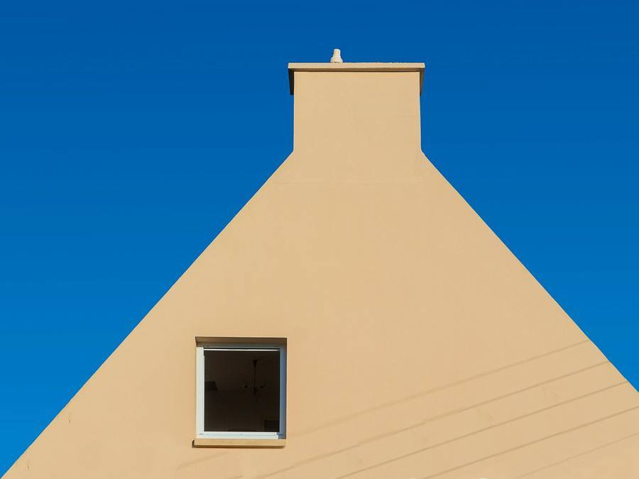
K-Rend Champagne is a warm, soft off-white — a gentler alternative to a bright white like Polar White or a cool grey. It has enough warmth to feel welcoming without tipping into an obvious cream, so it suits cottages, period-style homes, bungalows and modern houses that want a softer face. It sits well with warm brick, natural stone, timber and red or brown roofs. Like all K-Rend it is through-coloured, so it doesn’t need routine painting. As an indicative guide, K-Rend is commonly around £65–£95 per m² fitted, and choosing a standard shade rarely changes that.
- Champagne is a warm off-white — softer than a bright white, lighter than a full cream.
- Its warmth suits cottages, period-style and rural homes, but it also works on modern houses.
- It sits best with warm materials: red or buff brick, natural stone, timber and red or brown roofs.
- As a pale shade it still shows algae on shaded walls, though less starkly than a brilliant white.
- Its warmth is subtle and shifts with the light, so sample it large, on your own wall, over several days.
- It’s through-coloured and effectively permanent; colour choice rarely changes the price.
What Champagne looks like
Champagne sits in the space between white and cream. It’s a soft, warm off-white — lighter and cleaner than a full magnolia-style cream, but with a gentle warmth that a crisp white doesn’t have. On a wall it reads inviting and mellow rather than sharp and architectural, giving a home a settled, welcoming face without looking dated or heavy.
That subtlety is the appeal. It’s for homeowners who find bright white too clinical and cream too traditional. The warmth is understated: in some lights it reads almost white, in others the warmer undertone comes through clearly. That’s why it needs to be judged on the wall rather than on a screen. Like every shade in the K-Rend palette, it’s through-coloured, so the colour is built into the render.
Confirm the exact shade before you commit
Shade names are a guide, not a specification. Names and references differ between K-Rend ranges, and one manufacturer’s champagne can be another’s ivory or magnolia. So the first practical step is to find Champagne on the current chart for the range your installer is quoting, note the exact name and reference, and make sure it’s available in the finish you want.
That reference then belongs in the written quote, so there’s no doubt about which off-white is being mixed. With warm whites in particular, a small difference between two neighbouring shades can be obvious once it covers a whole elevation. Our K-Rend colours guide explains how the wider palette works.
The homes Champagne suits
Champagne’s versatility is its strength. Its warmth makes it a natural fit for traditional, period-style and rural homes, where a cool grey can look too contemporary and a stark white too clinical. It flatters stone, brick detailing and timber. Yet it’s soft enough not to feel old-fashioned, so it also works on modern homes that want warmth rather than a cool grey.
It’s a good choice if you like the idea of a light, bright house but worry that a pure white will feel cold or show every mark. Champagne gives much of the brightness with a gentler character. For the wider decisions about render type and finish that sit behind any colour choice, our guide to exterior rendering sets out the full picture.
Champagne on different types of house
How Champagne behaves depends a lot on the building it’s on:
- Cottages and rural houses — it sits comfortably with stone surrounds, timber and country settings, with a softer finish than bright white.
- Bay-fronted semis — it lifts a tired front without the starkness of white, and can sit well next to a neighbour that has kept its original brick.
- Bungalows — a light, warm shade keeps a low building feeling open and welcoming rather than boxy.
- Modern houses — it gives a softer alternative to the grey-and-white look, particularly with timber cladding or warm-toned window frames.
- Pebbledashed houses — where a full re-render replaces tired dash, Champagne gives a lighter, warmer face; the wall preparation will affect the cost far more than the colour.
- Extensions — useful where you want new work to sit quietly beside an existing warm-toned house rather than contrast with it.
Whatever the house, check it against what you’re keeping. A shade that looks right on a detached cottage can read quite differently when it sits shoulder to shoulder with a neighbour in a different colour.
Pairing Champagne with your roof
The roof is the largest fixed element on most houses and sets the overall temperature of the elevation. Champagne is at its most comfortable under warm red, brown or orange clay and concrete tiles, where its warmth echoes the roof rather than fighting it. That’s a real advantage on the many UK houses with warm-toned roofs, where a cool grey render can look disconnected.
Under a dark grey slate or grey concrete tile it still works, but the effect changes: the contrast is greater and the warmth of the render becomes more noticeable. Some homeowners love that; others find the render starts to look slightly yellow by comparison. Hold a large sample up near the eaves, in daylight, before deciding.
Windows, doors and trim
Window frames frame the render on every elevation, so they influence how warm Champagne looks. Timber or wood-effect frames, cream frames and softer greens or greys sit naturally with it. Brilliant white uPVC needs more thought, because a very white frame right next to a warm off-white can make the render look creamier or slightly dingier by comparison. It can still work, but judge it on a sample beside an actual frame.
Anthracite or black frames give a sharper, more contemporary edge and can suit a modern house; on a cottage they may feel heavy. The front door is the easiest place to add character: deep greens, blues and heritage colours look considered against a warm off-white. Keep gutters and downpipes in a colour that ties to the frames or the roof rather than adding another contrast.
Champagne alongside brick and stone
Many rendered houses keep some masonry — a brick plinth, brick quoins, a stone sill or a stone surround. Champagne is generally kind to these. Red and orange brick, buff brick and most natural sandstones and limestones sit comfortably beside a warm off-white, because the render shares some of their warmth. Very cool grey stone or blue engineering brick is a harder match.
On semis and terraces, the attached neighbour matters too. A Champagne house next to an unrendered red-brick twin usually looks harmonious; next to a crisp grey-and-white neighbour it can look softer than you expect. Our guide to render colours for red brick covers this pairing in more detail.
How Champagne compares to white and grey
Next to Polar White, Champagne is warmer, softer and more forgiving — less crisp and architectural, but cosier and a little less likely to show every mark. If you want white to look genuinely white, our K-Rend Polar White guide covers that option.
Next to a mid grey, Champagne is lighter and more traditional in feel, while grey reads cooler and more contemporary. A mid grey is also more forgiving of everyday grime, because it’s darker. If you’re weighing the two, our K-Rend grey guide explains how greys age.
Champagne or a fuller cream?
The difference between Champagne and a true cream is one of degree. A fuller cream has a more obvious yellow or buttery tone and reads clearly as a colour; Champagne stays closer to white, with warmth as an undertone rather than the main event. On a small card that difference can look trivial. Across a sunlit elevation it’s significant, because warm colours tend to look stronger at scale.
If you love cream but worry it will look dated, Champagne is the cautious step. If you want a house that clearly reads as cream, perhaps to match a village of cream-rendered cottages, a fuller shade may serve you better. Our guide to cream render houses covers that end of the spectrum.
How Champagne reads in different light
Light changes a warm off-white noticeably. On a south-facing wall in strong sun, Champagne can look almost white, sometimes with a faint glow. On a north-facing or shaded wall the warmth can flatten, and the shade may read greyer or slightly muddier than you expect. Evening light pushes it warmer again.
This matters most on houses with a dark, shaded side and a sunny front, where the same render can look like two shades. It’s not a defect; it’s how colour works outdoors. Texture plays a part too: a dry-dash finish scatters light differently from a scraped one, subtly changing how the same shade appears, so judge the sample in the finish you’ll actually have.
Weighing up a warm off-white? Get a free, no-obligation quote from one vetted local render specialist who can sample it on your wall.
Get a free quote →Exposure, algae and how Champagne weathers
Being an off-white rather than a brilliant white, Champagne shows surface algae and dirt a little less starkly than Polar White, but more readily than a mid grey. On a cool, shaded, north-facing or tree-lined wall, any render can develop a fine green or black film over time, and on a pale shade it shows. That’s a cleaning task, not a failure of the render; our guide on why K-Rend goes green explains the causes.
Watch the usual problem spots: beneath window sills, below leaking gutters and at ground level where rain splashes back off paths and soil. Good detailing, such as sills that drip clear of the wall and a sensible gap between render and ground, keeps pale shades cleaner for longer. On very exposed coastal or upland walls, ask your installer how the wall will be protected at these points.
Using Champagne in a two-tone scheme
Champagne is usually a single-colour choice, because its character is to soften rather than contrast. But it can work in a gentle, tonal two-tone scheme — for example, Champagne main walls with a slightly deeper warm stone shade on a ground-floor band, a porch or an extension. Two shades from the same warm family tend to look more considered than a hard contrast.
Pairing it with a cool grey or a very bright white as the second colour is riskier, because the two temperatures can fight. If you do use two colours, put the break at a corner, set-back or bead line rather than mid-wall, and ask your installer to mark the layout on a photo before work begins.
Matching Champagne on repairs and extensions
A pale warm shade can make a later patch easy to spot. If you’re extending a house that’s already rendered in Champagne, or repairing a damaged area, a fresh patch can look slightly different from surrounding render that has weathered or picked up dirt over the years — and on a pale, warm shade that difference is easy to see.
A few habits help. Clean the existing wall first, so you’re comparing new with the true colour rather than with grime. Confirm the original colour reference if you still have the old quote or specification. And ask the installer to finish new work to a natural break — a corner, a bead line or the junction between house and extension — rather than butting new against old in the middle of a wall, where any slight difference is most visible.
How to sample Champagne properly
Champagne is through-coloured — the colour runs through the render — so it doesn’t need routine repainting and can’t simply be changed later with a coat of paint. To change it you’d re-render. That makes sampling worth taking seriously, and with a warm off-white it’s more important than usual.
Ask for the largest sample you can get, in the finish you’ve chosen, and fix it to the wall rather than holding it at arm’s length. Look at it in bright sun, flat cloud and evening light over several days. Hold it against the roof, the window frames and any retained brick or stone. Photograph it from the pavement, because a warm shade reads differently at a distance. If your installer can point you to a finished Champagne house nearby, go and see it at full scale.
A worked example: Champagne on a bay-fronted semi
Take an illustrative case: a bay-fronted semi with tired painted pebbledash, a brown concrete-tile roof, white uPVC windows and an attached neighbour in original red brick. The owners want a lighter, warmer front without the starkness of bright white.
Champagne is a sensible candidate here, because the roof and the neighbour’s brick are both warm. The open question is the windows: brilliant white frames can make a warm off-white look creamier, so the sample goes up right beside a frame, on the bay and on the shaded side wall. If the frames make the render look dingy, the owners can try a slightly lighter warm white alongside it, or plan frame changes for later.
The bigger decisions sit behind the colour. The old dash has to be assessed — rendered over if sound, or stripped as part of a full re-render — and the break between the house and the neighbour’s brick needs a clean stop bead on the party line. None of that changes because the colour is Champagne, but all of it shows more on a pale shade.
A quick checklist before you choose Champagne
Run through these before you commit:
- Roof: is it warm-toned? If it’s cool grey, have you seen the sample beside it?
- Frames: will brilliant white or anthracite frames make the render look too yellow or too soft?
- Retained masonry: have you held the sample against the brick or stone you’re keeping?
- Aspect: have you seen it on the shaded side as well as the sunny front?
- Neighbours: how will it sit beside an attached house in a different colour?
- Upkeep: are you comfortable with an occasional gentle wash on any shaded walls?
- Paperwork: is the exact colour reference and finish written into the quote?
If any answer gives you pause, take another few days with the sample. A good specialist will wait while you decide.
Does choosing Champagne change the cost?
Picking a standard palette shade rarely changes the price of the render. As an indicative guide, K-Rend is commonly around £65–£95 per m² fitted. What really drives the price is the condition of the wall, scaffolding and access, the finish and the amount of detailing.
For scale, rendering by number of walls typically falls around indicative £3,500–£5,000 for one wall, indicative £5,000–£8,000 for two, indicative £8,000–£12,000 for three and indicative £12,000–£17,000+ for four or more. Our K-Rend cost guide and wider house rendering cost guide break the numbers down.
Keeping Champagne looking fresh
Upkeep is light. An occasional gentle, render-safe wash with the correct treatment lifts surface algae and grime and restores the original shade; a pressure washer is the wrong tool and can damage the finish. Keeping gutters clear, checking that sills drip clear of the wall, and cutting back planting that keeps a wall damp all reduce how often it needs doing.
Don’t paint over a tired-looking Champagne wall to brighten it. Painting through-coloured render removes its low-maintenance benefit and starts a repainting cycle; cleaning is almost always the right answer. Our guide on how to clean K-Rend walks through the method.
Briefing and hiring an installer
Before you accept a quote, check that it names the range and system, the exact colour name and reference, the finish, and what preparation is included — and that scaffolding and any removal of old render are in the price. Ask to see completed jobs a few years old, ideally in a pale or warm shade, so you can judge how the finish has weathered. Experience with the specific system matters more than any badge.
If you’d rather not vet contractors yourself, RenderSmart’s SmartMatch™ weighs render-type experience, verified reviews and reputation to pair you with one best-fit local specialist for a free survey and written quote. Most of our specialists take on projects from around £3,500, so they’re best suited to larger repairs and re-renders; for a single small job, a local builder or plasterer may be quicker.
When Champagne might not be right for you
If you want a crisp, sharp, architectural look, Champagne’s softness may disappoint; a bright white or a grey-and-white scheme such as K-Rend Pewter Grey will give more edge. If your house sits under a cool grey roof with anthracite windows, the warmth may look out of step. And if your walls are heavily shaded and you want minimal cleaning, a mid grey will hide marks better.
On an older, solid-wall or listed property, the bigger question is whether a modern through-coloured system is right at all. Many such homes need a breathable lime render, and a specialist should assess the wall first. For an overview of the brand’s systems before you settle on a colour, see our K-Rend service page.
Changing the type or colour of render can alter a house’s external appearance, and in a Conservation Area, National Park, National Landscape or the Broads planning permission is needed before rendering. A warm off-white may feel like a safe choice on a traditional street, but check with your local planning authority before committing; rules differ in Wales, Scotland and Northern Ireland. Our guide to planning permission for rendering explains more.
Frequently asked questions
What colour is K-Rend Champagne?
Is Champagne a white or a cream?
What roof colour goes with Champagne render?
Does Champagne work with white uPVC windows?
Does Champagne go with red brick?
Does Champagne show dirt?
Is Champagne a good choice for a modern house?
Can Champagne be used with a second colour?
Does K-Rend Champagne cost more than other colours?
Can I change the colour later?
Get a free K-Rend quote
Tell us about your property and SmartMatch™ pairs you with one vetted local render specialist who’ll help you sample warm shades on your wall — for a free, no-obligation quote and survey. No directory roulette, no pressure.
Get a free quote →