K-Rend Pewter Grey is a mid grey, and Sterling White is a clean white — together they make a classic two-tone, grey-and-white render scheme. A Pewter Grey body with Sterling White detailing (or the reverse) suits modern homes, extensions and updated post-war houses. Both are through-coloured, so neither needs routine painting. The grey is forgiving of everyday grime; the white lifts and sharpens the detail. As an indicative guide, K-Rend is commonly around £65–£95 per m² fitted, and choosing two standard shades rarely changes that much.
- Pewter Grey is a mid grey; Sterling White is a clean white — a natural body-and-detail pairing.
- Decide the balance first: a grey body with white accents is the usual way round, but white-led schemes work too.
- Colour breaks should fall at corners, beads or set-backs, never in the middle of a flat wall.
- Pewter Grey is more forgiving of grime; Sterling White shows algae and streaks sooner, so place it with care.
- Both are through-coloured and effectively permanent, so sample the two shades together on your own wall.
- Colour rarely drives the price; the wall, access and the extra detailing of a two-tone layout do.
Why Pewter Grey and Sterling White go together
These two shades earn a guide of their own because they work so naturally as a pair. Pewter Grey is a mid grey — dark enough to give a house real presence, light enough to cover a whole elevation without feeling heavy. Sterling White is a clean white. Put a grey body together with white detailing, or set white feature areas against a grey main wall, and you get a crisp, contemporary two-tone look. Both are shades from the through-coloured K-Rend palette, so the colour is built into the render rather than painted on.
The combination works because the two shades do different jobs. The grey grounds the house and hides the everyday marks any wall picks up; the white lifts, contrasts and draws the eye to the parts of the building worth looking at — a gable, a bay, a recessed entrance. Two shades with a clear job each is what separates a considered scheme from one that just looks busy.
Pewter Grey on its own
You don’t have to use the pair. On its own, Pewter Grey makes a confident single-colour scheme that sits comfortably on both modern and more traditional homes. As a mid-tone it has a practical advantage over very pale or very dark shades: mid greys are generally more forgiving than very pale or very dark shades for disguising day-to-day dirt and the early stages of algae, so the wall looks clean for longer between washes.
Whether it reads warm or cool on your house is something to judge on the sample rather than take from a name or a screen; the section on light below explains why. For the wider grey family, from pale silvers to anthracite, see our K-Rend grey guide.
Sterling White as the lift
Sterling White is the bright counterpart in the pairing. In a two-tone scheme it typically appears on feature panels, gables, bays, render bands or reveals, adding crispness to what would otherwise be an all-grey elevation. It can equally be the main colour with grey as the accent, depending on the look you want.
Like any white, it shows grime and algae sooner than the grey, so where it goes matters. White on a sheltered, well-ventilated front gable stays crisp; a white band directly under a dripping sill, or a white panel on a damp, tree-shaded side wall, will want cleaning far more often. If you’re weighing a brighter white instead, our K-Rend Polar White guide covers that shade.
Confirm the exact shade on the current colour chart
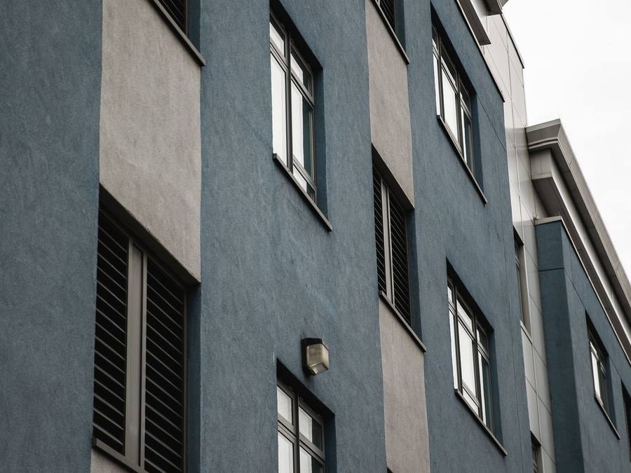
Shade names are a starting point, not a specification. Names and references differ between K-Rend ranges, and one manufacturer’s grey can be another’s silver, so the first practical step is to find both shades on the current chart for the range your installer is quoting and note the exact name and reference.
That reference then goes into the written quote. On a two-tone job the specification should say which colour goes where — “main walls: Pewter Grey; gables and bay: Sterling White” — so nothing is left to memory on the day the topcoat is mixed. It also confirms both shades are available in the finish you’ve chosen. Our K-Rend colours guide explains how the wider palette works.
Grey body or white body: deciding the balance
The usual approach is a Pewter Grey body with Sterling White accents. It suits most houses because the larger area is in the more forgiving colour and the white is reserved for features that deserve emphasis. It also tends to look more grounded on a hillside, a busy road or an exposed plot.
A white-led scheme with grey accents gives a lighter, airier result. It works well on smaller houses, bungalows or plots hemmed in by trees and neighbours, where an all-grey front could feel dark. The trade-off is upkeep: more white means more surface to keep clean.
A useful test is to ask which parts of the building you want people to notice. If the answer is “the gable and the entrance”, those get the contrasting shade and everything else stays in the body colour. If the honest answer is “nothing in particular”, a single colour may serve the house better than two.
Where the colour breaks should fall
A key difference between a smart two-tone scheme and an awkward one is where the two colours meet. Breaks look deliberate when they follow the building: an external or internal corner, a set-back, the line of a projecting bay, a horizontal band at floor level, or the edge of a gable. A colour change in the middle of a flat wall, with nothing to explain it, almost always looks like a mistake.
Because each through-coloured topcoat is applied separately, the break also has to be formed cleanly — typically at a bead line or a natural stop — so ask your installer how they’ll create each junction. Getting the break lines marked on a photo or elevation drawing before work starts is the easiest way to avoid surprises.
Once the work is done, good junctions are easy to spot: the line is straight and level, the two colours don’t bleed into each other, the edge is crisp along its full length, and the break sits exactly where it was agreed. A wavering line or a smear of grey on the white is a workmanship issue to raise before the scaffold comes down, not after.
The homes the pairing suits
The scheme is at its best on modern homes and contemporary renovations with features to pick out. A few common examples:
- New-build style detached houses with a front gable or projecting bay — grey main walls, white gable.
- Post-war semis being brought up to date — a grey body with a white ground-floor band or bay can transform a plain front.
- Bungalows — often better white-led, with grey on a feature wall or around the entrance, to avoid a heavy look on a low building.
- Extensions — a grey or white box can be used to separate new work from the original house deliberately rather than trying to match it.
It’s a broadly safe choice that sits comfortably on most streets. For how colour fits into the bigger decisions about system and finish, our guide to exterior rendering sets out the whole picture.
Pairing with the roof, windows and rainwater goods
The roof is the largest fixed element on the house and sets its overall temperature. A grey slate or dark grey concrete tile sits naturally with Pewter Grey and white. A warm red or brown tile is a harder match: the scheme can still work, but sample carefully, because a cool grey under a warm roof can look disconnected.
Windows matter almost as much. Anthracite or dark grey frames are the classic partner for grey render and read as a deliberate modern pairing. White uPVC also works, especially if Sterling White is used on reveals or bands so the frames tie into the scheme. Black or anthracite gutters, downpipes and fascias usually look tidier against grey than white ones, which can look stark. The front door is the place to add an accent, if you want one, rather than introducing a third render colour.
Pewter Grey alongside brick and stone
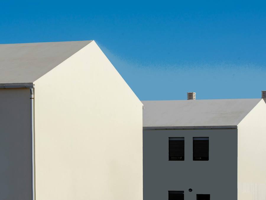
Many rendered houses keep some original masonry — a brick plinth, brick quoins, a stone sill or a neighbouring wall. These elements don’t change, so the render has to work with them. Grey and buff bricks and most cool-toned stone sit easily with a grey-and-white scheme. Strong orange or red brick needs more care; some homeowners love the contrast with mid grey, others find it jarring, which is why the sample has to be held up against the actual brick.
On semis and terraces, the attached neighbour is part of the picture too. A grey-and-white house next to a red-brick or cream twin can look sharp or out of place depending on the street. Our guide to render colours for red brick goes into this in more depth.
How the scheme reads in different light
The same grey can look like two different shades on two walls of the same house. On a south-facing elevation in bright sun, Pewter Grey reads lighter and softer, and the contrast with the white is gentler. On a north-facing or shaded wall it reads cooler and darker, and the white stands out more sharply. Texture has an effect too, because a scraped finish and a dry-dash finish scatter light differently.
This matters most when the scheme wraps round a corner. A grey front and a grey side may not look identical in practice, and a white gable on a north elevation may look brighter than one facing south. None of this is a reason to avoid the pairing — it’s a reason to view samples on more than one face of the house, at more than one time of day.
Exposure, shade and how each colour weathers
How a wall ages depends far more on its exposure than on its colour, but colour decides how visible that ageing is. On cool, shaded, north-facing or tree-lined walls, a fine film of surface algae can develop over time on any render. On Pewter Grey it tends to show late and subtly; on Sterling White the same film shows sooner and in higher contrast.
Watch the obvious streak points: under window sills, below gutters and at ground level, where rain splashes back off paths and soil. If a white band would sit right at ground level, or a white panel directly beneath a sill, consider swapping those areas to grey and keeping the white higher up. Our guide on why K-Rend goes green explains what causes it and why it’s a cleaning task rather than a fault.
Planning a grey-and-white scheme? Get a free, no-obligation quote from one vetted local render specialist who can sample both shades on your wall.
Get a free quote →Sampling the two shades together
Both shades are through-coloured — the colour runs through the topcoat — so neither needs repainting and neither can be casually changed later. To alter a two-tone layout you’d re-render, not paint over it. That makes sampling the most important hour you’ll spend on the decision.
Because the scheme relies on the relationship between the two colours, view them side by side rather than one at a time. Ask for the largest samples you can get and place them where the break will actually fall — the grey on the main wall, the white on the gable or bay. Look in bright sun, flat cloud and evening light, and photograph them from the pavement as well as close up, because the balance reads very differently from across the street. If your installer can point you to a finished two-tone job nearby, go and look at it.
Ask for the samples in the finish you’ve chosen, too, so you judge the real texture rather than a smooth card.
Scraped or dry-dash for a two-tone scheme
K-Rend is commonly finished either with the fine, even scraped texture or the coarser dry-dash, where aggregate is thrown into the surface; other finishes exist in some ranges. Most crisp grey-and-white schemes use a scraped finish, because the clean planes suit the contemporary look and make the colour break easier to read. Dry-dash gives a more textured, traditional appearance and hides minor imperfections, but it’s harder to clean — a consideration on any white areas.
Using the same finish for both colours is the usual choice; mixing textures as well as colours can tip a scheme into looking busy. Our guide to K-Rend roughcast covers the dashed finish in more detail.
Does changing to grey and white need permission?
Changing the type or colour of render can alter a house’s external appearance, and in a Conservation Area, National Park, National Landscape or the Broads planning permission is needed before rendering. So if you’re turning a red-brick or cream-rendered house into a grey-and-white one, check with your local planning authority first; rules differ in Wales, Scotland and Northern Ireland. Our guide to planning permission for rendering explains the details.
Does a two-tone scheme cost more?
Choosing standard shades rarely changes the price of the render itself. As an indicative guide, K-Rend is commonly around £65–£95 per m² fitted, and the main cost drivers are the condition of the wall, scaffolding and access, the finish, and how much detailing there is around bays and openings. A two-tone layout adds a little labour, because each colour is applied separately and every break has to be formed neatly.
For scale, rendering by number of walls typically falls around indicative £3,500–£5,000 for one wall, indicative £5,000–£8,000 for two and indicative £8,000–£12,000 for three. Ask for the second colour and any extra beads to be itemised so you can compare quotes like for like. Our K-Rend cost guide and wider house rendering cost guide break the numbers down.
Keeping a grey-and-white scheme looking crisp
Upkeep is light, but the two colours age at different speeds in the eye. A gentle, render-safe wash with the correct treatment lifts surface algae and dirt; a pressure washer is the wrong tool and can damage the finish. Clear gutters, check that sills drip clear of the wall, and cut back any planting that keeps a wall damp, because those simple measures reduce how often cleaning is needed.
Clean both colours at the same time, so the white doesn’t look bright against a dulled grey or vice versa. Never paint over through-coloured render to “refresh” a tired white panel; it removes the low-maintenance benefit and starts a repainting cycle. Our guide on how to clean K-Rend walks through the method.
Briefing and hiring an installer for a two-tone job
A two-tone scheme rewards an installer who plans the layout rather than improvising it. Before you accept a quote, make sure it states the range and system, both colour names and references, which areas take which colour, the finish, and how each break will be formed. Ask to see a completed two-tone job, ideally one a few years old, and check how the junctions have held up. Confirm that scaffolding and any removal of old render are included.
Experience with the specific system matters more than the badge on the van, so ask how many K-Rend jobs they’ve completed and how recently. If you’d rather not vet contractors yourself, RenderSmart’s SmartMatch™ weighs render-type experience, verified reviews and reputation to pair you with one best-fit local specialist for a free survey and written quote. Most of our specialists take on projects from around £3,500, so they’re best suited to larger repairs and re-renders; for a single small job, a local builder or plasterer may be quicker.
When Pewter Grey might not be right for you
The pairing isn’t for every house. On a period or solid-wall property, the bigger question is whether a modern through-coloured system is suitable at all; many older homes need a breathable lime render instead, and a specialist should assess the wall first. On a very traditional street of warm brick or cream render, a crisp grey-and-white front can look out of step, and in a conservation area it may not be permitted.
If you want the absolute minimum of upkeep, a single mid-grey body without white details is easier to keep looking fresh. And if your heart is set on warmth rather than crispness, a warm off-white such as K-Rend Champagne may suit you better. For an overview of the brand’s systems before you settle on a colour, see our K-Rend service page.
Frequently asked questions
What colour is K-Rend Pewter Grey?
What is K-Rend Sterling White?
Should the main walls be grey or white?
Where should the two colours meet?
Does Pewter Grey go with anthracite windows?
Does Pewter Grey work with a red tile roof?
Will the white parts go green?
Do I need planning permission to change my house to grey and white?
Does a two-tone K-Rend scheme cost more than one colour?
Can I change the colours later?
Get a free K-Rend quote
Tell us about your property and SmartMatch™ pairs you with one vetted local render specialist who’ll help you plan and sample a two-tone scheme on your wall — for a free, no-obligation quote. No directory roulette, no pressure.
Get a free quote →