K-Rend colours are through-coloured — the pigment runs through the topcoat, so the finish doesn’t need repainting and there’s no paint film to flake. Off-whites and greys are popular on modern UK homes, with warmer creams for traditional ones. Your choice is effectively fixed until you over-coat or re-render, so view large samples on the actual wall, in daylight, before committing.
- K-Rend is through-coloured — the colour runs through the topcoat, so there’s no painting and nothing to flake.
- Off-whites, greys and warm creams are the main shade families; bolder colours are usually kept to feature areas.
- Your choice is near-permanent, so always sample it on the actual wall and against the roof and windows.
- Very pale shades show algae and grime sooner; very dark shades run hotter in sun and suit some elevations better than others.
- What looks like ‘fading’ is often surface algae or dirt, which cleans off.
- Colour rarely changes the price; the finish and the wall do.
How K-Rend colour works
The defining feature of K-Rend colour is that it’s through-coloured: the pigment is blended through the topcoat before it’s applied, so the colour is the surface rather than a layer of paint sitting on top. That’s why a K-Rend finish doesn’t need repainting and why it can’t peel the way a painted wall does — there’s no film on top to come away. The trade-off is that the colour is chosen once, at the point of rendering, and is effectively fixed until the wall is over-coated or re-rendered. That permanence is exactly why it’s worth taking time over the decision.
Installers work from the manufacturer’s shade palette for the range they’re quoting, and not every shade is necessarily offered in every range or finish. Your specialist will tell you which shades are readily available in the range they’re quoting for. How colour fits into the wider decision about render types is covered in our guide to exterior rendering.
The popular K-Rend colour families
Tastes vary by region and property age, but UK homeowner choices cluster into a few clear families. Exact names differ between ranges, so treat these as broad groups rather than product codes.
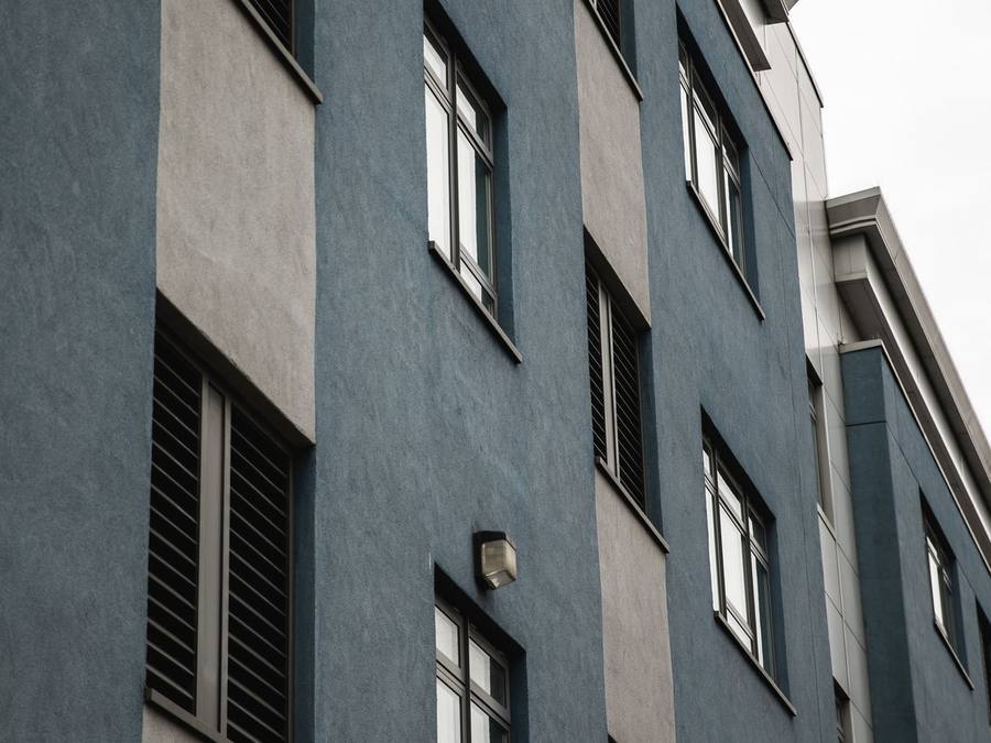
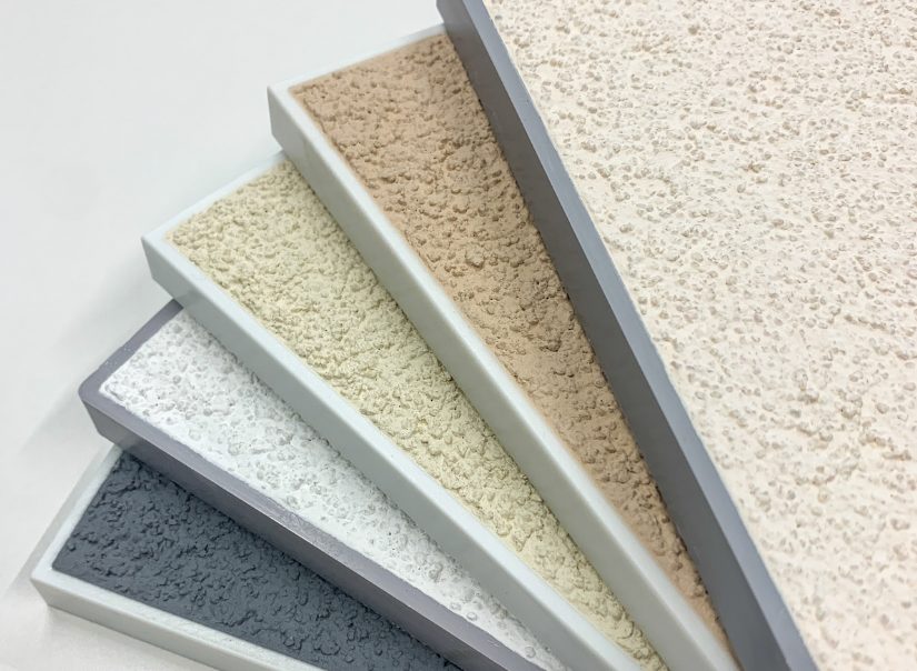
Whites and off-whites are the classic choice — crisp and bright, they suit contemporary and traditional homes alike. Greys, from pale silver-greys through to deep anthracite, have become a very common choice on new-build and renovation projects; they read as modern and pair well with dark window frames and roofs. Warm creams and sand tones flatter older and rural properties, sitting comfortably alongside brick, stone and timber. Bolder colours — deeper earths, greens or blues — appear occasionally, usually on a feature area rather than across a whole house.
Within each family there’s real range. Among whites, a bright, true white feels architectural, while a softer chalk or off-white reads warmer and is more forgiving of weathering. Greys span the widest: pale doves keep a home feeling light, mid greys give a confident modern look, and charcoals make a bold statement that works best with plenty of glazing and contrasting detail. Creams run from barely-there off-whites to richer buff tones that suit cottages and country settings. The most useful habit is to ignore the marketing names and judge the actual sample, because one manufacturer’s ‘ivory’ can be another’s ‘magnolia’.
Named K-Rend shades we cover in detail
We’ve given several named K-Rend shades their own guides, so you can see the trade-offs in more depth:
- Polar White — a crisp, bright white for a fresh, architectural look. Being so pale, it shows algae and grime sooner. See K-Rend Polar White.
- Pewter Grey and Sterling White — see K-Rend Pewter Grey.
- Champagne — see K-Rend Champagne.
For the wider families, our guide to K-Rend grey walks through the spectrum from pale silvers to anthracite, and K-Rend white focuses on keeping a white finish clean and bright. Shade names and availability can change between ranges, so always confirm the exact colour with your installer and get it written into the quote.
Grey vs white vs warm tones: which suits your home
The right family usually follows the style and surroundings of the property. Modern and new-build homes tend to carry grey and white well, especially where windows, fascias and the roof are already in cool, contemporary tones. Period and rural homes often look more natural in warm creams and sands that echo traditional limewashed walls. Look hard at the fixed elements you won’t be changing — brick plinths, stone surrounds, the roof colour, neighbouring houses — because the render has to live alongside all of them. A shade that looks great on a sample card can clash with a warm red brick or a particular roof tile.
Colour ideas by type of property
A few patterns are worth knowing before you shortlist, though your own street and materials should always have the final say.
Bay-fronted semis with brick detailing. Many keep a brick plinth, brick bays or tile-hung panels. Soft off-whites and warm greys tend to sit happily with red or orange brick, while a stark cool white can make the brick look harsher. Sample against the brick you’re keeping, not a clean board.
Victorian and Edwardian terraces. The colour is read as part of a run of houses. A shade that differs too sharply from the neighbours can look out of place, and many terraces sit in conservation areas where colour changes need checking. Restrained creams, stones and soft whites are the usual starting point.
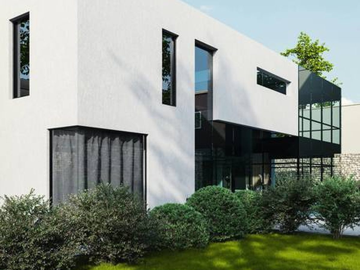
Modern detached and new-build homes. These carry cooler whites and greys well, especially with dark window frames. A two-tone scheme can help break up a large, flat elevation.
Rural cottages and older solid-wall homes. Warm creams and buffs usually look most at home. Before choosing any K-Rend colour, though, check the wall is suitable for a modern system at all — many solid-wall properties are better suited to breathable lime, which has its own colour approach.
Bungalows. A single-storey wall is a smaller canvas framed by a large roof, so the roof colour has an even bigger say. Lighter shades can stop a low building feeling heavy.
Choosing a colour that suits your street
It’s easy to fall for a colour in isolation and forget the wall will be seen in context. A shade that stands out tastefully can lift a whole frontage; one that fights its neighbours can date a house quickly. For most homeowners the safe, resale-friendly path is a broadly neutral shade — an off-white, a soft grey or a warm cream — that flatters the house without shouting.
Colour can also be a planning question. In England, rendering in a conservation area, National Park, National Landscape or the Broads needs planning permission, and even elsewhere, changing the colour or type of render can alter the external appearance and may need permission. Listed buildings need consent for works affecting their character, and Article 4 directions can remove permitted development rights. Rules differ in Wales, Scotland and Northern Ireland. Our guide to planning permission for rendering explains more, and your local planning authority can confirm what applies to your home.
Coordinating render colour with windows, roof and doors
A render colour is never seen on its own — it’s framed by everything else on the elevation, and the most successful schemes are chosen as a whole. The roof is the largest fixed element and sets the overall temperature of the house: a cool grey roof flatters greys and crisp whites, while a warm red or brown tile sits more happily with creams and sand tones. Windows and fascias are the next big influence; dark grey window frames and grey render read as a deliberate, modern pairing, while white frames suit softer whites and creams.
Front doors, garage doors and rainwater goods are your chance to add a considered accent — a deep blue or green door against an off-white wall, say. The trick is restraint: settle the render and roof relationship first, let the windows follow, and treat the door as the one place to introduce personality. Holding samples of all these elements together, outdoors, tells you far more than judging the render shade alone.
Light, aspect and how a colour really looks
The same colour can look like two different shades on two walls of the same house, and this catches people out. A south-facing elevation in bright sun reads lighter and warmer; a north-facing or shaded wall reads cooler, greyer and a touch darker. Under flat, overcast skies most colours lose contrast and can look heavier than expected. That is why the same shade can suit a sunny front and look flat on a shaded side return, so judge it on the elevation where most of it will be seen.
How the finish changes a colour
K-Rend is most commonly finished scraped or dashed (other finishes exist in some ranges), and the two don’t show colour in the same way. A scraped finish has a fine, even texture, so the colour on the wall stays close to the colour on a flat sample. A dashed or roughcast finish carries visible aggregate; the stones and the tiny shadows between them tend to make the wall read a little darker and more mottled from a distance, and the aggregate itself can add flecks of a different tone.
That means a dashed wall needs a dashed sample. Judging a dashed colour from a smooth swatch is an easy way to end up with a wall that isn’t quite what you pictured. Our guide to K-Rend roughcast covers the dashed finish in more detail, including how it affects cleaning.
Render colour trends — and choosing something that lasts
It’s worth separating what’s fashionable now from what you’ll still be happy with in fifteen years, because a render colour outlives most decorating trends. A shade that feels current because it suits this year’s new-builds may not suit your house, your roof or your street in the long run.
You don’t have to follow the crowd, but it pays to be honest about why you’re drawn to a colour. A broadly neutral shade tends to age gracefully and appeal to the widest range of future buyers, which matters given the colour is fixed for a long time. A bolder choice can be wonderful on the right house, but it’s a more personal bet. If resale is a consideration, lean towards the timeless end and save the boldness for the front door.
One colour or two? Feature elevations and detailing
Most homes are rendered in a single colour, and there’s real elegance in that simplicity. But a two-colour scheme can add character where the architecture invites it — a contrasting band at ground-floor level, a darker feature gable, or a recessed entrance picked out in a deeper tone. Because each colour is applied separately and the change needs a clean, straight break, a multi-colour scheme adds a little to the labour and needs planning into the specification from the outset.
The pitfall is over-complication: too many tones, or contrasts that fight the roof and windows, can make a house look busy. Keep the palette tight — two shades from the same family, or a classic grey-and-white pairing — and ask your specialist to show you exactly where the break lines will fall. Breaks work best on natural architectural lines such as corners, bay edges or a change in plane, rather than across a flat wall.
Dark shades: heat and suitability
Deep greys, charcoals and other dark colours absorb far more of the sun’s heat than pale ones. A dark wall on a sunny elevation runs hotter and moves more as it heats and cools, which puts extra stress on the render system. That makes a sound substrate, a fully bedded mesh and a properly cured base coat matter even more under a dark finish.
Render manufacturers can restrict how dark a shade may be used on some systems or backgrounds, so if you’re drawn to a very deep colour, ask your installer to confirm it is suitable for your system and elevation before you commit. A dark shade on a sheltered, north-facing wall is a different proposition from the same colour on an exposed, south-facing one.
Do K-Rend colours fade?
This is one of the most common worries. Because the colour runs through the topcoat rather than sitting on it as a film, there’s no paint layer to wear away or peel, and a through-coloured finish generally holds its colour well. All exterior finishes weather to some degree, though, and very deep or intense shades tend to show change more readily than mid-tones.
What homeowners often interpret as fading is actually surface algae or grime dulling the finish — particularly on cool, shaded or north-facing walls. That is cosmetic and usually reversible with a render-safe clean; our guide to K-Rend going green covers causes and cleaning. For the wider question across all render types, see do render colours fade.
How colour affects maintenance
Colour choice has a quiet influence on how a wall ages in the eye. Very pale shades look immaculate when clean but show algae, splashes and dirt in higher contrast, so they may want washing a little more often — especially low down, near paths and under sills. Very dark shades look striking but can show salts, water runs and dust more visibly. Mid-tones — soft greys, warm creams, stone shades — tend to be the most forgiving, disguising the day-to-day marks that any exterior wall picks up. None of this should rule out a colour you love; it’s simply worth knowing how each behaves.
Getting a consistent colour across the house
A through-coloured wall only looks right if the colour is even from one end to the other, and a few practical points help. Ask how the installer manages batch consistency — for example by ordering enough material for each elevation at once — so a delivery halfway through doesn’t show as a change of shade. Ask too how they plan working areas and breaks, since stopping mid-wall can leave a visible line in the finish.
Matching an existing render is harder than it sounds. If you’re rendering an extension next to a wall finished years ago, the original will have weathered, so a fresh batch of the “same” colour may not match exactly. The same applies to patch repairs. Options include accepting a slight difference on a separate elevation, choosing a deliberately contrasting colour for the new part, or re-finishing the adjoining elevation so everything reads as one.
Does colour affect the price or lead time?
For the most part, colour is a free choice. Picking a standard palette shade rarely changes the cost or timeline. If a shade isn’t stocked in your chosen range or finish, ask early so any effect on price or lead time is known before you commit. A two-colour scheme adds a little labour for the extra break lines. What actually drives the price is covered in our K-Rend cost guide — the wall’s condition, access and the finish — and the wider guide to house rendering cost sets that in context.
Got a shortlist of colours? Get a free, no-obligation survey and quote from one vetted local K-Rend specialist.
Get a free quote →How to judge a colour sample properly
Most colour regret traces back to deciding from something too small, in the wrong place. A postage-stamp chip under showroom lighting is close to useless; colour reads completely differently at scale and in natural light. Wherever you can, get a large sample board in the finish you’re having and live with it for a few days. View it on the actual elevation it’ll be used on, and look in bright sun, flat cloud and the low light of evening, because a shade you love at noon can turn cold by dusk.
It also helps to see the colour on a finished house at full scale — a good installer can usually point you to completed jobs. And always check the sample against your fixed elements: hold it up to the brick plinth, the roof and the window frames rather than against a white wall indoors.
Getting the colour right: practical steps
A simple routine prevents nearly all colour regret. Gather a shortlist from the current range your installer is quoting for, not old photos. Order physical samples in the right finish and, where possible, see the shade on a finished house nearby. View them on your own wall against your brick, roof and windows at different times of day. Check planning if you’re in a protected area or changing the colour of existing render. Once you’ve decided, get the exact colour and finish written into the specification and quote, so there’s no ambiguity on the day.
A K-Rend colour may not be the right path for every home. On a listed building or a solid-wall property that needs breathable lime, the colour decision follows the material decision, not the other way round. And if you’re planning K-Rend render and want a specialist who’ll give you time to be sure, SmartMatch™ pairs you with one vetted local renderer for a free, no-obligation survey.
Frequently asked questions
Does K-Rend come in different colours?
What are the most popular K-Rend colours?
Does K-Rend need painting?
Do K-Rend colours fade?
Can you get K-Rend in grey or anthracite?
How do I know which K-Rend shades I can have?
Why does my K-Rend look a different colour in different light?
Can you change the colour of K-Rend later?
Do I need planning permission to change my render colour?
Will a new K-Rend extension match my existing render?
Get a free K-Rend quote
Settled on a shade? SmartMatch™ pairs you with one vetted local render specialist for a free, no-obligation quote and survey — so you can see your colour on the wall before you commit.
Get a free quote →