The best render colours for most UK houses are soft off-whites, warm creams and stone shades, and mid greys, because they suit British light, sit comfortably with brick, slate and tile roofs, and hide everyday dirt better than brilliant white. Anthracite and other dark shades suit modern homes but absorb more heat and are restricted on some systems, while heritage and pastel colours work best where they reflect local character. There’s no single best shade: the right render colour depends on your roof, windows, neighbours and the direction your walls face, so always judge large samples on your own wall, in different light, before you commit.
- Off-whites, warm creams and stone shades, and mid greys are the safest all-round render colours.
- North-facing walls make colours look cooler; south-facing walls warm and bleach them — test on more than one elevation.
- Choose with your roof, windows, brick details and street in mind, not from a small swatch.
- Dark shades absorb more heat and some systems limit colours below a set light reflectance value.
- Brilliant white shows dirt and algae soonest; mid-tones disguise them best.
- A significant colour change can need planning permission in protected areas — check with your council.
Render colours that work on most UK houses
If you want a colour that will look right on almost any house and still look right in ten years, start in the middle of the palette. Soft off-whites, warm creams, stone and sand shades, and mid greys suit the UK’s soft, often overcast light. They sit well with typical UK roof materials — grey slate, dark concrete tiles and red or brown clay tiles — and they’re forgiving of the dirt and weathering every exterior wall picks up.
At the edges of the palette, brilliant white and very dark shades such as anthracite can look striking, but they’re less forgiving. Whites show every streak and patch of algae; darks absorb heat and need the right system. Heritage and pastel colours can be lovely where they suit the setting and less so where they don’t.
The rest of this guide works through each colour family, then through the things that change how a colour looks in real life, and finishes with a practical step-by-step way to choose. It applies whether you’re choosing a through-coloured render or a painted one, and across all the main render types.
The six main colour families
Render manufacturers each have their own palettes and names, but nearly every shade falls into one of six broad families. Thinking in families first, then individual shades, makes the choice much easier.
Whites — bright, clean and crisp.
Off-whites and creams — whites softened with a touch of warmth or grey.
Warm neutrals — stone, sand, buff, biscuit and soft taupe.
Greys — from pale silver through mid greys to deep slate tones.
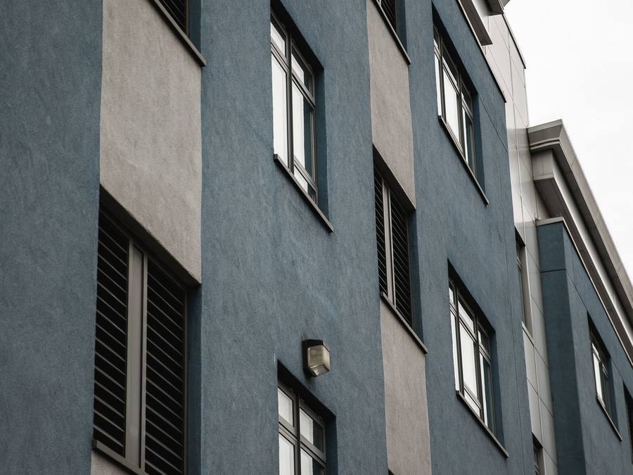
Anthracite and dark shades — charcoal, near-black and deep blue-greys.
Heritage and pastel colours — soft pinks, ochres, pale blues and greens, and traditional earth tones.
Most homeowners settle on the first four. They’re versatile and easy to live with. The last two are more of a statement and need more thought about the house, the street and the system.
Whites: crisp, bright and high-maintenance
A bright white render looks sharp and fresh, especially on contemporary houses with large glazing and dark frames, and it reflects the most heat of any colour, so it suits virtually every system. The downside is visibility: white shows rain streaks below sills, splashback, green algae on shaded walls and roadside grime sooner than any other shade, and it can look cold under grey skies. A white with a hint of warmth or grey reads as white from the street but is far more forgiving up close. Our guide to the white render house covers choosing between whites and keeping one clean.
Off-whites and creams: the safe, flattering middle
Off-whites and creams are a dependable choice for UK houses. A white with a little yellow, red or grey in it looks bright without glaring, warms up in low winter light and sits comfortably next to brick, stone and timber. Warmer creams suit period homes and clay-tiled roofs; cooler off-whites suit modern houses and grey slate. The trap is that a small swatch can look almost white indoors and quite yellow on a sunny wall, so test large samples side by side. Our guide to the cream render house goes further, including matching local stone.
Warm neutrals: stone, sand and buff
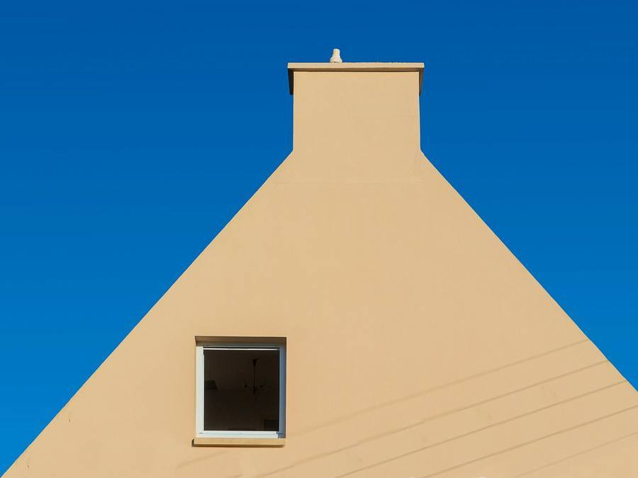
Stone, sand, buff and biscuit shades echo natural building materials, which is why they suit areas with a strong local stone tradition. A render that picks up the colour of nearby stone walls, quoins or lintels tends to look as if it belongs.
These colours are very forgiving. They disguise dust, splashback and light algae far better than whites, and they age gracefully. They also bridge traditional and modern well: a pale sand looks soft on a cottage, while a cooler greige or taupe looks smart on a newer house with anthracite windows.
The main risk is muddiness. A neutral that’s too dark or too brown can look flat under grey skies, and some buff shades look noticeably more orange in strong sun. Look at them next to your roof and window colours, and in both direct sun and shade, before deciding.
Greys: versatile and modern
Grey suits a lot of modern UK housing. Mid greys look contemporary, pair naturally with anthracite frames and hide dirt well; pale silver greys give a light look without white’s upkeep. The secret is undertone: blue-leaning greys can look cold on a north wall, while warm “greige” tones sit better with older brick. In a two-tone scheme, keep both greys in the same undertone family. Our guide to the grey render house covers depth, undertone and pairings in detail.

Anthracite and dark shades: bold, with conditions
Anthracite, charcoal and other deep shades give a strong, architectural look that suits contemporary homes, extensions, garden rooms and feature walls. Against timber cladding, glass and light paving, a dark render can look superb.
Dark colours do come with practical conditions. They absorb much more of the sun’s heat, so the render surface gets hotter and moves more as it heats and cools. That puts more stress on the system, which is why some manufacturers limit very dark colours on certain systems, require special heat-reflective formulations, or don’t allow them over insulation boards at all. Deep shades can also show fading and chalking sooner on sunny elevations, and they make pale dust and efflorescence more visible.
None of that rules dark render out. It means the colour, the system and the elevation have to be chosen together, by a renderer who knows the product. Using a dark shade on one sheltered feature wall rather than a whole sun-facing house is a common compromise.
Heritage and pastel colours
Soft pinks, pale blues and greens, ochres and earthy reds have a long history on UK houses. Seaside towns, harbour villages and some historic market towns are known for colourful rendered terraces, and in those places a pastel can look exactly right. Traditional limewashed buildings also have their own palette of soft, chalky earth colours.
Outside those settings, strong pastels can be harder to pull off and may date more quickly than neutrals. They’re also the colours most likely to attract attention from a planning authority in a protected area, and the most likely to divide opinion with neighbours.
If you’re drawn to colour, a good approach is to look at what works in your area. Walk the streets near you, note the colours that look settled and attractive, and use those as your starting point. A muted version of a colour often looks better on a whole house than the bright version on a chart.
How light, aspect and region change a colour
The same render colour can look like three different colours on the same house. That’s mostly down to light.
North-facing walls get cool, indirect light. Colours look darker, greyer and bluer than on the chart, and whites can look chilly. Warmer shades often look better here.
South-facing walls get strong, warm sun. Colours look lighter and warmer, and creams can look yellower. Over time, sunny walls also fade and chalk faster on painted finishes.
East- and west-facing walls change through the day, with soft morning light and warm evening light.
Region and setting matter too. The light by the coast is brighter and more reflective than in a valley town. Surrounding greenery tints walls slightly green; neighbouring red brick reflects warmth. A colour that looked perfect on a holiday cottage in a sunny region may look quite different under northern skies.
The practical lesson is to test your shortlist on the walls that face different ways, and look at them in the morning, at midday and in the evening, on both bright and dull days.
Matching your roof, windows, brick and neighbours
Your render isn’t seen on its own. It’s seen against the roof, the windows and doors, any brick or stone details, and the houses either side. Choosing with those in mind is the single biggest step towards a colour that looks right.
Roof. Grey slate and grey concrete tiles suit cool off-whites and greys. Red and brown clay tiles suit warmer creams, stone and sand shades.
Windows and doors. White uPVC suits warm whites, creams and soft neutrals. Anthracite and black frames suit greys, crisp whites and dark feature walls. Timber and coloured frames are worth taking outside with your samples.
Brick and stone details. If you’re keeping a brick plinth, quoins or a stone surround, pick a render colour that complements their tone rather than fighting it; our guide to render colours for red brick covers part-rendered houses, and our guide to render colours for a 1930s semi covers the classic interwar pair.
Neighbours. On a semi or terrace, your house is half of a pair or part of a row. A colour that sits comfortably beside next door usually looks better — and adds more kerb appeal — than one that clashes, even if it’s lovely on its own. It’s also courteous to mention a change of colour to adjoining neighbours.
Want help choosing a colour that suits your house? SmartMatch™ pairs you with one vetted local render specialist for a free survey and written quote.
Get a free quote →Test panels and samples on your own wall
Never choose a render colour from a screen or a small printed chart. Screens distort colour, printed charts are tiny, and both are viewed indoors. Colours almost always look lighter and brighter on a whole house than on a swatch.
Get physical samples. Ask your renderer for samples of the actual finish in your shortlisted colours, as large as they can provide. Texture affects colour, so a sample in the right finish is worth far more than a flat chip.
Look at them on your wall. Hold or fix them against the wall, at eye level and further up, on at least two elevations facing different directions.
View them in different conditions. Sun and cloud, morning and evening, dry and after rain. Step back to the street too: that’s the view everyone else will have.
Ask about a test panel. On a larger job, your renderer may be able to apply a small test area in your chosen colour, ideally somewhere discreet, before the full job. This is the most reliable way to judge a through-coloured finish, which you can’t easily change later.
Look at real houses. Ask your renderer for addresses of finished jobs in the colours you’re considering, and go and look.
Light reflectance value and limits on dark colours
Every colour has a light reflectance value, or LRV: a measure of how much visible light it reflects, on a scale from roughly 0 for black to close to 100 for pure white. Manufacturers usually publish the LRV for each shade in their range.
LRV matters for render because low-LRV colours absorb more of the sun’s energy and get hotter. A hotter surface expands and contracts more, which can stress the render, particularly where it’s applied over insulation boards that stop heat escaping into the wall. For that reason, some systems set a minimum LRV for certain build-ups, some offer special formulations for darker shades, and some simply don’t allow the darkest colours in certain situations.
The limits vary from one manufacturer and system to another, so there’s no single number to work to. If you want a dark or strong colour, tell your renderer early and ask them to confirm, in writing, that the shade is approved for the system and the elevation. This is especially important on insulated systems; our guide to EWI render explains how those systems are built up.
LRV is also useful the other way round: it helps you compare how light two shades will really look on the wall, which a screen can’t tell you.
How dirt, algae and fading vary by shade
Every exterior wall gets dirty in time. What changes from colour to colour is how much you notice it.
Whites and very pale shades show dirt, rain streaks and green algae soonest, especially on north-facing and shaded walls and below sills and copings.
Mid-tones — mid greys, stone, sand and warm creams — are the most forgiving. They disguise everyday dirt and light algae, and need cleaning least often.
Dark shades hide green growth well but can show pale dust, salts and fading on sunny elevations.
Fading depends on both the colour and the finish. Deep, saturated colours fade more noticeably than pale ones. Painted finishes fade and are renewed when you redecorate; through-coloured finishes change much more slowly. A lot of what looks like fading is really a film of dirt, which a gentle, low-pressure clean can remove. Our guides to do render colours fade and algae on render explain what’s really changing and how it’s treated.
How texture and finish change a colour
Texture changes colour more than most people expect. A rougher surface catches more shadow, so the same shade looks slightly darker and softer on a textured finish than on a smooth one. Smooth and fine finishes show colour more evenly and crisply, but also show marks and patching more readily.
Scraped finishes, such as those common on monocouche, have a soft, slightly mottled character. Dashed and Tyrolean finishes break colour up with texture and shadow, which helps hide dirt. Fine-grained thin-coat finishes give the cleanest, most modern look.
That’s why it pays to see samples in the actual finish you’ll be getting. Our guides to textured vs smooth render and silicone render finishes cover how finish choice affects appearance and maintenance.
How colour works on different render types
How you get your colour, and how easily you can change it, depends on the render.
Through-coloured renders — silicone, acrylic, monocouche and many mineral renders — have the pigment mixed into the finish. They don’t need painting, but the colour is effectively permanent until the wall is recoated or re-rendered, so getting it right first time matters. Our guide to through colour render compares this with painted finishes.
Painted renders — usually sand and cement and many Tyrolean finishes — get their colour from masonry paint, so you can change it at each redecoration.
Lime renders are often finished with limewash, which comes in a soft, chalky palette suited to traditional buildings and can be renewed in a different shade.
Brand palettes vary, but they cover the same families described here. If you’re considering a particular system, our guides to K-Rend colours and silicone render colours look at those ranges in more detail, and our guide to monocouche render colours covers that system. For an overview of the systems themselves, see our page on render types.
Ask whether your chosen shade affects the price or lead time when you get your quote; our house rendering cost guide covers what does drive the price.
Colour, planning and conservation areas
In England, replacing existing render with render of a similar appearance is usually permitted development. Changing the type or colour of render, however, can alter the external appearance of the house, and a significant change may need planning permission. In a conservation area, National Park, National Landscape (formerly AONB) or the Broads, rendering the outside of a house needs planning permission, and the colour is likely to be part of what the council considers.
Some areas also have Article 4 directions that remove permitted development rights, sometimes including changes to external finishes and colours. Flats and maisonettes don’t have householder permitted development rights. Listed buildings need listed building consent for works that affect their character, and the conservation officer will usually expect traditional materials and colours; see our guide to rendering a listed building.
Rules differ in Wales, Scotland and Northern Ireland. This is general information, not legal advice: always check with your local planning authority before committing to a colour, especially a bold change. Our guide to planning permission rendering explains the rules and how to get certainty.
A step-by-step way to choose a render colour
1. Check the rules. Find out whether you’re in a conservation area or other protected area, or subject to an Article 4 direction, and whether your house is listed.
2. Look at your fixed elements. Note the colour of your roof, window frames, doors, gutters and any brick or stone you’re keeping.
3. Look at your street. Photograph the houses either side and the wider street. Note which colours look settled.
4. Pick a family. Decide on one or two colour families before looking at individual shades.
5. Shortlist three shades. Include one slightly lighter and one slightly warmer or cooler than your favourite.
6. Check the system. Ask your renderer whether each shade is available and approved for the system and elevations, especially dark colours.
7. Test on your wall. Use large samples in the right finish on at least two elevations, in different light, over several days.
8. Step back. View from the street and the end of the road, not just up close.
9. Think long-term. Ask whether you’ll still like it in ten years, and whether it will suit a future buyer.
10. Confirm in writing. Make sure the exact colour reference is written on your quote or contract.
Common render colour mistakes
Choosing from a screen or tiny swatch. A frequent mistake, and a common reason people are surprised by how light or bright their finished house looks.
Ignoring the roof and windows. A colour that clashes with the fixed elements will never look quite right.
Following a trend too closely. A very fashionable shade can date quickly. Trends are better expressed on a feature wall or front door than across a whole house.
Choosing brilliant white for a shaded wall. It will show green algae and dirt sooner than almost any other colour.
Assuming a dark colour is available on any system. Check heat limits and approvals before you fall in love with anthracite.
Forgetting the neighbours and planning. On a semi or terrace, and in a protected area, the colour isn’t only your decision in practice.
When colour isn’t the real question
Choosing a colour is the enjoyable part of rendering, but it only matters if the render underneath is right. If your existing render is cracked, hollow or letting water in, or the wall needs a breathable system rather than a modern one, those decisions come first and the colour follows. And if your render is sound and you simply want a fresh look, repainting a painted render may be all you need; some homeowners also consider wall coatings on sound render.
When you’re ready to talk colours and systems for your own house, SmartMatch™ weighs render-type experience, verified reviews, online reputation, insurance and accreditation to introduce you to one vetted local specialist for a free, no-obligation survey and written quote, including samples in the finish you’re considering. Most of our specialists take on projects from around £3,500, so they’re best suited to larger repairs and re-renders; for a single small job, a local builder or plasterer may be quicker. Our guide to how SmartMatch works explains the process, and our exterior rendering guide covers systems and finishes in full.
Frequently asked questions
What are the best render colours for UK houses?
How do I choose a render colour?
Is white or grey render better?
Do dark render colours cause problems?
What is LRV in render colours?
Which render colour hides dirt best?
Why does my render colour look different from the sample?
Do I need planning permission to change my render colour?
Can I change my render colour later?
Does render colour affect the price?
See your colour on the right render
Tell us about your property and SmartMatch™ pairs you with one vetted local render specialist for a free, no-obligation survey and written quote.
Get a free quote →